Thursday, 19 January 2017

Liz West

Yesterday, Liz West visited Uni and gave a presentation during one of our lectures. We have a guest speaker most Wednesday's but this one was definitely my favourite.

Liz is currently exhibiting her work at

1. Canary Wharf, London
2. Broadgate, London
3. Leeds college of art, Leeds
4. The Met theatre, Bury.

I would really like to visit at least one of her exhibitions. I will definitely be going to see her show at Leeds College of Art. I really liked the photographs of her 'colour wheel alumni exhibition' which is open until 27th January as part of the college's 170th birthday celebrations.

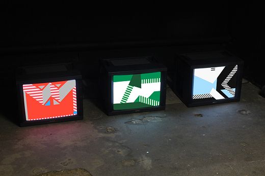
Liz creates vivid environments that mix luminous colour with light. She works in a variety of media and she aims to provoke a heightened sensory awareness in the viewer through her works. I really liked how she is interested in exploring how sensory phenomena can invoke psychological and physical responses, tapping into the relationships we may have with colour.

West's investigation into the relationship between colour and light is often realised through an engagement between materiality and a given site. West uses light as a material that radiates outside of its boundaries and containers in large and open spaces (like old co-op buildings, churches and the streets of Manchester). She playfully refracts light through using translucent, transparent or reflective materials, directing the flow of artificial and natural light.

Our understanding of colour can only be realised through the presence of light. By playing and adjusting colour, West brings out the intensity and composition of her spatial arrangements.

Installations
Seven fold, Autumn lights, Our colour, Our spectral vision, Our colour reflection, Your colour perception, Through no. 3, An additive mix, Through No. 1, Solstice ritual, Complimentary afterimage, Shifting Luminosity, Vanishing boundaries, Tempo, an additive mixture, Difference is important, Chamber series.

Her 'Our colour' installation was one of my favourites, I love how all the colour and pigment runs into each other. I wondered if my feelings / emotions would change as I passed through a certain colour? I like how the walls, ceiling and floor are shiny, smooth and light in colour. I assume that if the room has carpet the coloured light would be absorbed and the piece wouldn't be so effective. Liz stated that this room was used by a wide variety of people including skateboarders and people meditating.

Drawings
Equal amounts of blue, Restricted juxtaposition, Subjective mixtures, Consumed.

I honestly loved all of Liz's work and it has inspired me a lot - especially as I love working with bright vivid colours myself. Although it would be quite hard for me to work effectively with 'light and space' at the moment, she has still given me some very good ideas which ill be working on throughout my current projects - crash sites, art/activism and drawing transformations.

I found it extremely interesting and a little emotional listening to her talk about personal, sensitive subjects.

Its always great to hear about the journey of a practicing artist - it gives me hope for the future!

Here are some images of Liz West's work.


Wednesday, 11 January 2017

Question Time!

Q: How old were you when you realised you wanted to be an artist?
A: "I think I was about 18. I never really knew what I wanted to do in the future until I did art at A-level. Iv always loved sketching and painting but I think just saw this as a hobby until I did the art foundation course. That's when it got serious."

Q: What do you like to draw?
A: "To be honest, I don't really enjoy drawing. I mean, I do like it but I prefer working with other materials like paint, tape and on a much larger scale. I always used to think art was just about drawing, but I found it quite hard to sit down and produce good work with just pencils or pens."

Q: Was art your favourite subject at school? If so, why?
A: "In school my favourite subject was definitely art but I also loved geography. I wasn't very academic and found written exams quite hard. Along with PE, art was a nice break from the rest of my time table. Although there was ALOT of work to do, I didn't mind as much because I enjoyed doing it."

Q: Would you recommend art at college/university?
A: "Yes, I would. For me, the art foundation course at college helped loads. It was there I really started to develop as an artist / figure out my own style of work. University allows me to be more independent and although there are loads of routes you can take, I'm glad I picked University."

Q: How is university going?
A: "Uni is going well. We've just received grades and feedback from some assignments we submitted before Christmas. I got 71.00 and 75.00 (which probably doesn't mean anything to you) but these were my first pieces of written work and I'm very proud of my marks. I hope to improve on them in the future."

Q: Do you have any advice for students applying for an art course next year?
A: "Don't be scared. Its natural to be nervous at first but your confidence, creativity and skills will improve throughout the year. I think it's important to find an audience for your work, so people can connect with it - this will come naturally over time and its nothing to worry about. Also, just keep at it and be persistent. Consistency is key!"

Q: Who are your favourite artists?
A: "Iv looked at hundreds of artists over the past few years. At the moment my favourite artists are Sol Lewitt, Teesha Moor and Martin Creed. Different artists are introduced to me on a daily basis and I love researching and developing ideas, using artists as inspiration."

Q: Who has inspired you?
A: "A lot of artists have inspired me over the years but mainly my tutors and my GSCE teacher."

Q: Do you definitely want to be an art teacher?
A: "I've always wanted to be a teacher since I was about 8 years old. I thought I wanted to be a primary school teacher or a PE teacher because I loved football. I would definitely like to be a teacher of art in the future but I'd also like to be able to produce and sell my own artwork. That would be cool."

Q: What do you do in your spare time?
A: "When I'm not at Uni, I'm often doing art work at home or in the library. I work on Saturdays and Sundays but in my spare time I like to go shopping."

Q: What is your favourite colour?
A: "I like red, pink and light blue but my favourite colour would have to be purple."

Q: How was the transition from college to Uni?
A: "The transition was much easier than I thought it would be. I think I was well prepared for Uni after completing my final piece at college. I knew exactly what to expect and what was expected of me. I think the University open days and workshops also helped."

Q: Do you enjoy living out for Uni? Is it a good experience?
A: "I do enjoy living out and I have enjoyed meeting new friends. I like the fact that my halls are in walking distance from the campus and I feel like Iv settled in well but I also like that I'm not too far away from home and I can go back whenever I want."

Q: Do you enjoy your course?
A: "Yes, I definitely like my course. Even though I'm only timetabled in 3 days a week, I find myself working on my project briefs for 5 or 6 days a week. All the tutors are a massive help, suggest really good ideas and are open to any questions I may have."

Q: In terms of art, do you have a favourite quote?
A: ''Art it not what you see, but what you make others see.''

Q: What music do you listen to and does it influence your work?
A: "At the moment I'm listening to Arctic Monkeys, Little Mix, Ed Sheeran and Robbie Williams. In fact, I got Robbie tickets for Christmas and I can not wait! In school, music influenced my work loads because I liked to include lyrics... it doesn't really influence my work so much now, but when I'm working I like to listen to the charts. I like all types of music."

Wednesday, 7 December 2016

Identity

Following on from the previous project, I continued to develop my ideas on physical context by looking at place, scale and the audience of visual work and how it impacts the meaning of the work. This project helped me expand my knowledge as I was able to further develop and explore themes of ‘identity and narrative’. I found this interesting, especially as I was able to compare modern artists with artists from the past. It was interesting to see how both worked with the themes of ‘identity and narrative’ and how they experimented with images, processes, objects and materials. I found that new narratives were created, providing me with a rich and varied source of inspiration throughout this project.

Elsworth Kelly was the first artist I looked at, as he was really influential after the war. She became well known for his bright canvasses after influencing the development of minimalism and pop art. He maintained persistent focus on the dynamic relationships between shape form and colour, which definitely interests me. I like how Kelly created irregular shaped canvasses as well as flat sculptures and line drawings, which challenged my conception of ‘space’.

I thought Elsworth Kelly would be a good artist to look at because I’d like viewers to be able to identify my work and experience it with physical responses to the works structure and surrounding space. Real life observations are the backbone of Kelly’s abstraction works. He said “They are replications of the shapes, shadows, and other visual experiences in the world around me”.  When creating my final piece for this project I used mainly Elsworth Kelly (along with Rhys Coren) as inspiration and used bold, contrasting colours, free of recognisable imagery and brushstrokes. Here is an image of Rhys Coren's work - a representation of a football strip. I did something similar. 

http://www.seventeengallery.com/wp-content/uploads/2012/06/IMG_6223-1.jpg

Sarah Morris is another artist I researched. She has been producing abstract paintings and films describing mainly urban and social factors in different cities. She looks closely at architectural details along with the psychology of a city. She began her career producing graphic paintings and I would describe them as ‘dramatic,’ especially with the emotive language used in newspapers/advertising headlines. Her recent series of work is about Rio, Brazil and she seems to have looked at the contrast between ‘urban Rio’ with the city’s beaches, fruit stands etc. From looking at her paintings, I would imagine Rio has lots of hospitals, factories, modern architecture and (football) stadiums, especially after hosting the Olympics in 2016.

http://www.tate.org.uk/art/images/work/P/P78/P78599_10.jpg

I thought about certain colours I was going to use in the piece of work and seen as football is something I’m definitely interested in, I decided to go down that route. I thought about the team I support along with their identity (Manchester City)
Home kit – light blue/dark blue
Away kit – black/red
Third kit – orange/purple
This links in with my project as it’s about the identity of a certain place, like I would associate ‘Big Ben’ and ‘The Eye’ with London and ‘Eiffel tower’ and ‘Champagne’ with Paris.

Sarah Morris shifted her focus towards Paris in 2014, where she obviously explored cultural, economic and social typologies by looking into Louis Vuitton in Paris; along with champagne, perfume and fashion – the artist explores concepts of national identity.

Tuesday, 6 December 2016

Skills and aptitudes


In one of our recent CPiC lectures we looked at the skills we possess and the skills we feel like we need to improve, especially if we want to work in a professional environment in the future. I did find this lecture useful because it was about applying creative abilities into a job in the art industry. It was also nice to know what other students thought of me after taking part in the group activity.

Before this lecture I wasn’t so sure on the difference between skills, aptitudes and characteristics. Now, I am much more confident between the three. I learnt that a skill is the learned activity to carry out a task with pre-determined results often given within a certain amount of time / energy. An example of this could be learning to drive. An aptitude is a natural ability to do something. An example for this could be a child with an aptitude for painting and drawing. A characteristic is a feature of quality belonging typically to a person, place or thing.

This skills map shows different categories, containing many different skills which are all required in a professional work environment. Before studying the mind map, I looked at what I thought were the most important professional attributes. These were
  • Leadership skills
  • Interpersonal skills
  • Problem solving skills
  • Self-motivation
  • Efficient
  • Detail oriented
  • The ability to prioritise
  • Team player
  • Reliable
  • Ability to multitask
I have highlighted the skills I feel like I already possess (pink) and the skills I felt like I needed to improve upon (green). I found this part quite difficult and I didn’t quite understand what some of the terms meant e.g. ‘Classifying and synthesizing’. As I mentioned, we took part in a group activity which was very useful but at the same time I feel like it became more challenging as others thought I had skills which I didn’t think I had, so then I thought about examples and experiences to ensure that the skill was highlighted in the correct color for me – pink or green?

From having a general look at the map, it seems to be that ‘Co-operating’ is an area where my skills are rather good as I believe I have good listening skills, I can give or accept constructive criticism, I can support others, motivate others and I can present a positive personal image. Other skills I have highlighted in pink include ‘attention to quality’ and ‘working on your own initiative’ which are particularly useful to have whilst studying an art degree. I feel like ‘Creativity’ is one of my main strengths and I’ve always wondered why some people are able to generate loads of ideas super fast and think creatively, whilst others seem to struggle to do so?

‘’The best way to have a good idea is to have lots of ideas’’ – Linus Pauling.

I have used green on the skills which I think could be better, it’s not that I’m really bad at them. For example, speaking in front of an audience is something I’d always found difficult at school. I was able to do it; I just wasn’t very confident at it. I found that I knew the information, and what I want to say I just became nervous and slightly hesitant.

My ICT skills aren’t fantastic but I know what I need to know. I can use my E-mails, Word, Publisher, PowerPoint and Excel with confidence. In comparison to others, my IT skills are bad – I wish I knew how to use photoshop, for example. My telephone skills could easily be improved – I think it’s because we don’t use the telephone in an education environment or in a professional practice, but I’m presuming over the next few years we will begin to use the telephone more in a professional manner as we start to get jobs. We communicate with our teachers, lecturers and fellow students in person. I think some of the skills will come more naturally as we get older and more mature.

I found this ‘skills map’ analysis exercise very useful in order for me to improve. If I was to do this exercise again I would definitely have a third color, where I would highlight the skills I wasn’t 100% sure about. Most of the skills could’ve been either pink or green and I found it challenging to distinguish between the two because a lot of the time it would change, depending on the circumstances.

Environment

This project developed themes of scale, material and audience. It also further developed the ideas of narrative, context and interpretation.

I thoroughly enjoyed this project brief and I found myself asking questions like
  • Where does art really belong?
  • What factors influence the meanings we associate with places?
  • How might I influence of alter perceptions and ideas by exploring context and juxtaposition.
I visited the Yorkshire Sculpture Park, where I collected visual and textual information / data. I considered the landscape and the exhibitions. I thought about the landscape as an environment for art. I also thought about how it might be read – socially, culturally, politically and historically before applying it to a gallery context, thinking about how individuals could relate to it.

Yayoi Kusama was the first artist I researched for this project. Yayoi Kusama was born in March 1929 and is a Japaneese artist and writer. Throughout her career she has worked with a wide variety of media including paint, collage, sculpture, performance art and environment installations. I like how her work usually shows a strong interest in colour, repition and pattern – exactly like my work although it looks so different. She is influenced by minimalist and feminist artwork.

Image : www.pinterest.com/yayoikusama

Kusama started creating art at an early age, going to study painting at Kyoto in 1948. In 1957 she moved to New York where she produced a series of paintings which were influenced by abstract expressionist movement.  Personally, I find the European/American art more interesting although some of the most interesting abstract artists are from Japan. Yayoi moved back to Japan in 1973 and became an art dealer but her business folded and after a few years she was admitted to a mental hospital… I can see her work includes psychological content.

Then, I looked at Martin Creed’s work. He is a British artist and musician who currently lives and works in London. He was born in Wakefield but moved to Glasgow when he was 3. He studied art at the Slade, London. Creed’s work is often a small intervention of the world and uses whatever materials he feels are suitable. One of my favourite pieces is “work No. 200,” where the cubic space is filled with balloons. I could’ve tried something like this as I think it’s a really interesting way to get the audience to engage with the environment. I really like how the majority of Martin Creeds work seems to be very structured and organised. This is exactly how I plan my work to be – especially when working with geometric shapes.

Image : http://observer.com/2016/06/10-things-to-do-in-new-yorks-art-world-before-june-10/

Martin Creeds work is sometimes quite controversial. At one of his exhibitions, a visitor threw eggs at the walls of Creeds empty room as a protest against the turner prize, declaring that Creeds presentations were not “real art” and that “painting is in danger of becoming an extinct skill in this country”. I feel like this is very ironic as Creed has been exhibiting paintings in nearly exhibition he has done over the past years. In 1994 Creed formed a band called ‘Owada’ and he used both his music and art talent to form an even better piece of visual work.

Bridget riley was born in April 1931 in London. She’s an English painter who currently works in London, Cornwall and France. Between 1956 and 1958 Riley nursed her father (who was a well-known printer) as he had been involved in a serious car accident. Her early work seemed to be figurative with a semi impressionist style. She was also a teacher at this point, until 1960’s, when she began to develop her signature art style. I like how she mainly uses black and white. I love how the patterns and geometric shapes she creates have quite a distorting effect on the eye. Riley’s style seems to have been influenced by a number of sources and I feel like her work greatly influenced me as I loved the variety of geometric shapes and forms she uses, which produce sensations of movement / colour. They make me feel slightly “sea sick.”

Riley began investigating colour in 1967, the year she produced her first striped painting. Her trip to Egypt inspired her to use hieroglyphic decorations. She created her own ‘’Egyptian pallet”. Could I’ve used a holiday or a different tradition to influence my work?

Sol Lewitt was born in 1928 in Hartford and worked up until his death in 2007. He studied a fine art degree and then worked as a graphic designer in New York. I especially love how his work always maintained the idea or concept – what can art be? Sol Lewitt was probably my biggest inspiration whilst completing this project. 

Image : http://massmoca.org/sol-lewitt/

 I like how most of his work is colourful, similar with the contrast in Bridget Riley’s work. I like how its abstract and conceptual. Lewitt believed that the idea itself is a work of art. I aimed for my work to be colourful and abstract, including a few black and white pieces, or even a main black and white piece!  Lewitt’s work ranged from sculpture/painting/drawing. Most of his conceptual pieces often did take on a basic material form. Larger scale of wall pieces were not completely controlled by the artist as apprentices carried out his instructions, which were deliberately vague.

My work didn’t involve anybody else but if I was to leave a team with instructions, the emphasis would definitely be on the process and materials rather than producing work with a narrative. I don’t see meaning as a requirement like other Artists. If my work is aesthetically pleasing - I’m happy.

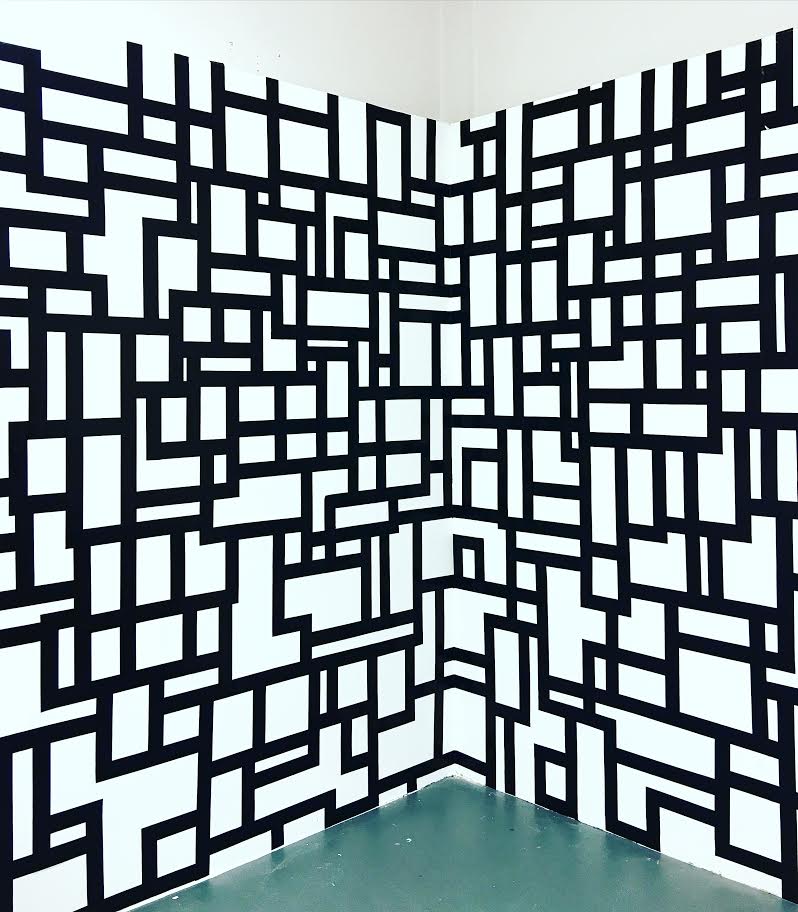
Here are some photographs of my final piece for this project. I experimented with different ideas before producing the final outcome. Here are some of the questions I had to ask myself / test out during the development stage.
  • Am I going to work directly onto the studio walls or onto paper?
  • Am I going to continue working onto the floor, until the tape runs out?
  • How much tape should I buy?
  • Should I leave the tape and roll stuck to the wall once it's coming to the end of the roll
  • Think about what colour tape I will be using
  • Think about the background colour or contrast
  • Are there any other objects I could work on in the studio environment e.g. a chair?
  • Will I plan it out first or will all the lines be spontaneous? 


My final piece 


Text and Image/Random Narratives


This was a three week project where we worked both collaboratively and individually. I looked at the relationship between text and image, between what is seen and what is read in a contemporary art context. I liked this project as it introduced some of the key ideas to how we think about the relationship between text and image. I was encouraged to experiment and explore the ways in which things and artefacts I produce are read or interpreted – both explicitly and implicitly. I was forced to think about how this may be applied and used within contemporary art.

Throughout the first week we shared images in small groups (which we collected during freshers week) and began to discuss the narrative possibilities of random and disparate materials when they are placed together. We began to explore new contexts - a wide range of possibilities were explored, debated and developed. I considered the ways in which narratives, material and processes impact upon meaning and communication as we worked towards a more individual approach. 

During this project I attended a workshop. I particularly liked the warm up exercise in groups of 3. On A3 paper we had to do 2 x 7 minute drawings of the other two people in our group.  These were line drawings and I used pencil, graphite and charcoal. We then spoke about how each of us felt about the drawings and how we felt about being drawn. We then worked together to produce another, more experimental life sized representation of each person. I tried to interpret the word ‘representation’ loosely  and expanded on the idea of a caption by incorporating a wide range of text into the work – words I had seen, spoken, heard and read.

Throughout the three weeks I researched artists including Judy Wize, Edward Ruscha, Teesha Moor, Bruce Nauman, Matt Dinniman, Cheryl Sorg, Mira Shcendel, Greg Sand and Sean Williams. 


Here his one of the development pieces I produced using Greg Sand as inspiration. I took Photographs in Grave yards, before cutting out silhouettes.


Teesha Moore is another artist who inspires me. She lives in Washington and believes in following dreams and passions. She is a very successful artist and is well known for her quirky scrapbook pages. I really like her work as it’s mostly collage – I really like the idea of ripping up images, sticking them back together and adding bits to them to give them a whole new meaning.

Her inspiration was graphic design and music. She collected childrens books, design books, art books, cook books and quote books. I like that because she would mix all these up, jumble them together in her brain and they would come out the other end as art.

Matt Dinniman is an artist from the UK who is most famous for his collage work. He tends to cut up and collage animals with hats and sunglasses etc. I thought this artist would be a good influence for me and this project as he uses dictionary pages. From what I can see, I don’t think the background writing is relevant to the image.

From hipster dogs to chimps in space and rhinos looking for a first date, every creation is the direct result of little sleep and too much caffeine which is why I think using coffee to stain the pages would be a good idea – it could represent too much caffine at the same time as giving the background an old look. I like how Matt Dinniman combines traditional art, photography and illustration.

There are many animals I could look into. I thought I would research this artist because all of the others seem to focus on people. I have collected visual research from animal magazines and also leaflets from various farms. I’ve taken lots of photographs and drew from them, before adding accessories. Here are a some examples of some quick sketches I produced, using ink and twigs/sticks. I made some natural drawing tools using things from the environment, I got this idea from a trip we went on, where we had to produce landscape pictures using soil, grass and sticks.