Following on from the previous project, I
continued to develop my ideas on physical context by looking at place, scale
and the audience of visual work and how it impacts the meaning of the work.
This project helped me expand my knowledge as I was able to further develop and
explore themes of ‘identity and narrative’. I found this interesting,
especially as I was able to compare modern artists with artists from the past.
It was interesting to see how both worked with the themes of ‘identity and
narrative’ and how they experimented with images, processes, objects and
materials. I found that new narratives were created, providing me with a rich and
varied source of inspiration throughout this project.
Elsworth Kelly was the first artist I looked
at, as he was really influential after the war. She became well known for his
bright canvasses after influencing the development of minimalism and pop art.
He maintained persistent focus on the dynamic relationships between shape form
and colour, which definitely interests me. I like how Kelly created irregular
shaped canvasses as well as flat sculptures and line drawings, which challenged
my conception of ‘space’.
I thought Elsworth Kelly would be a good artist
to look at because I’d like viewers to be able to identify my work and experience
it with physical responses to the works structure and surrounding space. Real
life observations are the backbone of Kelly’s abstraction works. He said “They
are replications of the shapes, shadows, and other visual experiences in the
world around me”. When creating my final
piece for this project I used mainly Elsworth Kelly (along with Rhys Coren) as
inspiration and used bold, contrasting colours, free of recognisable imagery
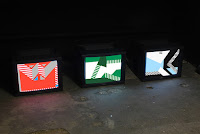
and brushstrokes. Here is an image of Rhys Coren's work - a representation of a football strip. I did something similar.
 |
| http://www.seventeengallery.com/wp-content/uploads/2012/06/IMG_6223-1.jpg |
Sarah Morris is another artist I researched. She
has been producing abstract paintings and films describing mainly urban and
social factors in different cities. She looks closely at architectural details
along with the psychology of a city. She began her career producing graphic
paintings and I would describe them as ‘dramatic,’ especially with the emotive
language used in newspapers/advertising headlines. Her recent series of work is
about Rio, Brazil and she seems to have looked at the contrast between ‘urban Rio’
with the city’s beaches, fruit stands etc. From looking at her paintings, I
would imagine Rio has lots of hospitals, factories, modern architecture and (football)
stadiums, especially after hosting the Olympics in 2016.
 |
| http://www.tate.org.uk/art/images/work/P/P78/P78599_10.jpg |
I thought about certain colours I was going to
use in the piece of work and seen as football is something I’m definitely interested
in, I decided to go down that route. I thought about the team I support along
with their identity (Manchester City)
Home kit – light blue/dark blue
Away kit – black/red
Third kit – orange/purple
This links in with my project as it’s about the
identity of a certain place, like I would associate ‘Big Ben’ and ‘The Eye’ with
London and ‘Eiffel tower’ and ‘Champagne’ with Paris.
Sarah Morris shifted her focus towards Paris in 2014, where she obviously explored cultural, economic and social typologies by looking into Louis Vuitton in Paris; along with champagne, perfume and fashion – the artist explores concepts of national identity.
No comments:
Post a Comment